Gets or sets a value which defines the TextDrawingStyle for the text displayed by the tooltip.
[Visual Basic]
Public Property TextStyle As TextDrawingStyle
[C#]
public TextDrawingStyle TextStyle {get; set;}
Property Value
A value from the ToolTipsFactory.Enums.TextDrawingStyle enumeration.
| Overridable |
Layout-file |
Property of | |||
| AnimationTT | ImageTT | SingleLineTT | MultiLineTT | ||
|
|
|
 |
|
 |
|
Description
This property defines how to render the foreground of the font used for the tooltip-text. The following styles are available:
| Style | Description | Example | Rendering properties |
| Solid | The tooltip text will be painted with a solid color font. The color used for this text-style is the value assigned to the FontColor-property. | 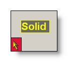 |
|
| LinearGradient | The tooltip text will be painted with a linear color gradient. The range of colors to be used for the gradient are specified in the FontGradientColors-property. | 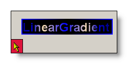 |
|
|
Texture... (There are 12 texture-related text-styles. See FontTexture for more details) |
The tooltip text will be painted with the texture assigned to the FontTexture-property. | 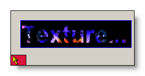 |
|
| Hatch | A hatched text will be painted using the hatch-pattern assigned to the FontHatchStyle-property. The foreground color used to draw the hatch-pattern is the color assigned to the FontHatchColor-property, while the background color is taken from the FontColor-property. | 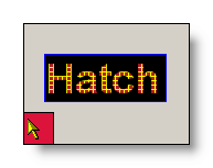 |
The TextStyle-property only defines what kind of style should be applied to the tooltip text. The details on how the selected TextDrawingStyle has to be rendered, are specified by various other properties of the tooltip component. Table 1 shows this rendering properties for each TextDrawingStyle. Only the values assigned to this properties will affect the corresponding TextDrawingStyle.
If specified at the component-level for a tooltip component (i.e. by assigning the value directly to the component), the assigned value will become the default TextStyle for the tooltips of all controls on the same form. This default TextStyle can be overridden for each control through the Override-property provided to all controls on the same form by the tooltip component (see "The Override-Property").
Please note: If TextStyle is to be overridden in code (as shown in Example 2), a different enumeration then TextDrawingStyle has to be used. The TextDrawingStyleOverride-enumeration is equivalent to the TextDrawingStyle-enum, but it provides one more value (OverrideOff), which is used to reset the font-override.
Example 1
This statement defines a default TextStyle for all controls on the same form as the tooltip component:
'set the default text-style to LinearGradient...
Me.MultiLine.TextStyle = TextDrawingStyle.LinearGradient
Me.MultiLine.FontGradientColors(0) = Color.Red 'gradient start-color
Me.MultiLine.FontGradientColors(1) = Color.Yellow 'gradient end-color
Example 2
How to override the default TextStyle (or any other overridable property) through the various designers and editors in Visual Studio is extensively discussed in "The Override-Property". If the override-value for the TextStyle has to be set or changed at runtime for the tooltip of a specific control, the following code is needed:
'This changes the text-style for the tooltip of Panel1
'to "Texture"...
Me.MultiLine.GetMultiLineToolTip(Panel1).Override _
.FontLayoutOverride.TextStyle = TextDrawingStyleOverride.TextureStretch
'...and loads the desired texture from an image-file.
Me.MultiLine.GetMultiLineToolTip(Panel1).Override _
.FontLayoutOverride.FontTexture = Image.FromFile("C:\Temp\water.jpg")