This chapter describes how the ToolTipsFactory tooltip components provide new properties to all controls on a form and how this provided properties can be used to individually assign tooltip content and layout-features to each control on the form.
Background
As soon as a ToolTipsFactory tooltip component is dropped on a form, it provides an extended property to all controls on the form and the form itself (which is also a control).
For those who don't know about extended properties: Extended properties are properties that are not part of the properties provided (or implemented) by a given control, but are provided by another component to all controls (or a subset) in the same container (in this case the form). These extended properties appear in the properties-list (and therefore also in the Visual Studio property-grid) of the extended control as if they were normal properties of the control.
Extended Properties provided by the ToolTipsFactory
The principles, methods and functionality discussed in this section apply to all ToolTipsFactory tooltip components.
The easiest way to understand the concept of this extended properties is to see what happens to the property-list of a simple windows forms button, when a ToolTipsFactory tooltip component is added to the form. For this experiment we create a new form with just one single button on it:
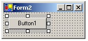
If we look at the property-list of the selected button in the Visual Studio
property-grid, we see just the properties that are usual for this kind of
control:
Now we drop a ToolTipsFactory AnimationToolTip (from the Toolbox) on the form...
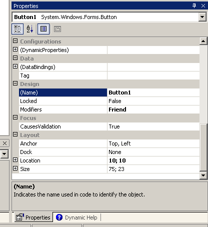
...and again inspect the property-list for Button1:
As you see in the image above, the property-list of the button-control (Button1) now lists an additional property (AnimationToolTip on ToolTipsFactoryAnimation1). This new property, which appears in the also new property-category "ToolTipsFactory", is the main property provided by the ToolTipsFactory AnimationToolTip component. The strange property name (AnimationToolTip on ToolTipsFactoryAnimation1) is to be read as "Property AnimationToolTip which resides on the component named ToolTipsFactoryAnimation1", or - put the other way - "Property AnimationToolTip provided by ToolTipsFactoryAnimation1".
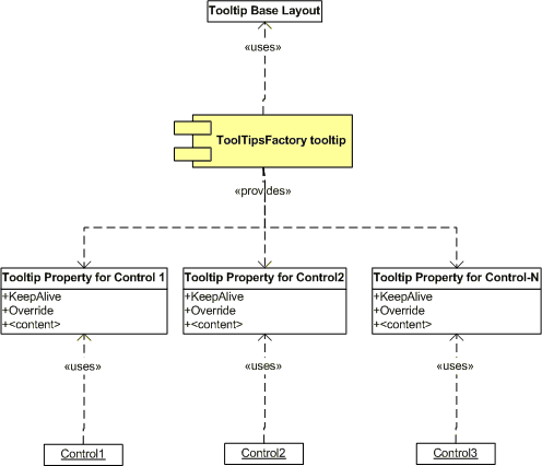
The following UML-drawing illustrates this relationships in a more abstract way:
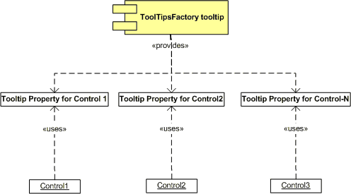
Basically, the tooltip component creates and maintains an instance of a tooltip-property-object for each control on the form (container), which hosts the tooltip component. Each control then exposes this object (actually the instance maintained for it by the component) through it's property-list.
All ToolTipsFactory tooltip components provide such an extended property to the controls on the form on which they reside. The top-level value of the provided property shows the tooltip-content currently assigned to the selected control (this means the content to be displayed by the tooltip, when the mouse pointer hovers over the selected control) or an appropriate description of this content (e.g. the image-size for the ImageToolTip or the number of frames for an AnimationToolTip). If the value states that the content is "(empty)", no tooltip will be shown in the compiled application when the mouse moves over the selected control (except the content will be assigned at run-time by the program).
The inner structure of the provided properties
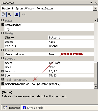
As you can see from the (+)-sign in front of the provided property in the Visual Studio property grid, this provided properties are composed or complex properties. Actually this provided properties point to complex objects which enclose several content and layout properties for the corresponding tooltip assigned to the selected control (see Picture 1). At this level, the provided property behaves as a read-only property: The value "(empty)" can not be modified nor can the property been removed.
(Picture 1)
To get access to the changeable properties of the provided property, it has to be expanded by a click on the (+) on the left side of the property name, after which it reveals the inner structure of the provided property. The main inner structure is the same for all ToolTipsFactory tooltips. The following image shows the expanded property provided by the ToolTipsFactory AnimationToolTip:

As already mentioned, the top-level line of the provided property is always read-only. It just shows the tooltip content assigned to the selected control. The image above shows how it looks for a control where the tooltip is still disabled because there is no assigned content.
To assign or define the content to be displayed in the tooltip for a specific control, we have to locate the property which holds this information. Now this leads us to the only notable difference in the structure of the properties provided by the various ToolTipsFactory tooltips: The name of the property which holds the actual content is different in some cases because it would be confusing, if - for instance - a property which should hold an image, is named "Text". The following list shows the name of the main content property for the different types of tooltips:
| Component | Property for tooltip content |
Example |
| SingleLineToolTip: | Text | 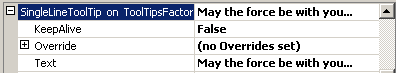 |
| MultiLineToolTip: | Text | 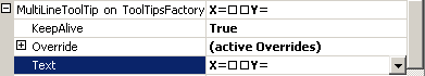 |
| ImageToolTip: | Image | 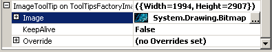 |
| AnimationToolTip: | AnimatedSymbol | 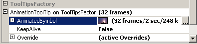 |
The list also shows how the assignment of content is reflected in the displayed value of the corresponding content property and the top-level provided property of the different tooltip components.
The other two properties accessible in the expanded provided property are the boolean KeepAlive and Override properties.
The KeepAlive-Property
The property KeepAlive is a flag, which defines what happens, when the mouse pointer is still moving over the control and the AutoPopDelay-period (the time the tooltip will be visible) defined for the tooltip is over: If set to True, the AutoPopDelay-timer only starts counting when the pointer stops moving around, set to False it turns the tooltip off after the AutoPopDelay-period is over even if the mouse pointer was moving over the control. (KeepAlive=True is the way to go, if you want continuous dynamic display of values in the tooltip while the mouse is moving over the selected control and you want the tooltip to stay visible as long as the mouse does not leave that control.)
The Override-Property
This property is again an expandable property. As shown in the list above (not expanded), it is the read-only top-level view of a complex object that manages override-values for all possible tooltip layout properties. This layout override values are attached to the selected control (e.g. Button1), or - in other words - each control gets it's own set of layout override values through the property provided by the ToolTipsFactory tooltip component (see Picture 1).
The main function of this layout override values is to override specific properties of the base-layout (defined through the ToolTips layout-designer) provided by the tooltip component. This approach holds several significant benefits for the application developer:
The generic (or base) tooltip layout specified at the component-level applies to the tooltips of all controls on the form.
The look of the tooltip can be differentiated for each control on the form. It's only necessary to specify what's different from the generic layout through the Override property. (E.g., you can define the tooltip-background to be green for the [Ok]-Button and red for the [Delete]-Button, while the rest of the controls on the form have no defined overrides for the tooltip and therefore have a blue background as defined in the base layout.)
Only one tooltip component (e.g. a SingleLineToolTip) needs to be placed on a form. Through the override-mechanism it is possible to give the tooltip of each control on the form a slightly different appearance or a complete new look. Without the override-mechanism it would be necessary to place on the form one tooltip-component for each differing tooltip layout.
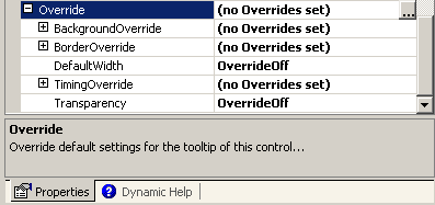
As already mentioned, the Override-property itself is only a read-only property. It is just the entry-point to access the actual properties of the Override-object. The value of the Override-property shown in the Visual Studio property-grid reflects whether there are overridden layout elements ("(active Overrides)") or if no tooltip layout overrides ("(no Overrides set)") have been defined for the selected control. This is useful to see at a glance, if the tooltip layout for a specific control differs from the generic tooltip layout defined for the form.
The inner structure of the Override-Property
As soon as the Override-property is expanded in the property-grid, it gets clear that its structure is quiet complex.
(Picture 2)
If one keeps in mind, that the Override-property (or object) is supposed to be able to override every layout-property of a ToolTipsFactory tooltip, it becomes clear that the Override-object cannot be an object with just a couple of properties. At first glance it seems that there is only a handful of properties, but actually most of them turn out to be hidden or grouped into three other objects, which appear as nested expandable properties in the property-grid:
|
Property |
Description |
| +BackgroundOverride | A nested object which gives access to all layout override properties for the tooltip-background. |
| +BorderOverride | A nested object which gives access to all layout override properties for the tooltip-border. |
| DefaultWidth | This property overrides the DefaultWidth set in base layout. |
| +TimingOverride | A nested object which gives access to all timing override properties for the tooltip. |
| Transparency | This overrides the Transparency defined in the base layout. |
Please note: The screen-shot and the table above show the situation for the AnimationToolTip. The kind and number of layout override properties depends on the kind of tooltip component that provides the extended property. But the principles discussed in this section do apply to all properties found in the Override-objects of the different tooltip components.
The value shown in the property-grid for the expandable properties (BackgroundOverride, BorderOverride, TimingOverride etc.) follows the same scheme as for the Override-property: If there are no overridden layout elements in the corresponding object the (read-only) value shown is "(no Overrides set)", and "(active Overrides)" if one or more layout elements are overridden.
Most of the normal - not expandable - properties, where the value can be changed, do show "OverrideOff", "(none)" or an empty color as value as long as the value is not manually changed. This applies to all normal properties in the Override object-hierarchy.
If a new, valid value is entered for an overridable layout property (typed in, selected from a dropdown-list etc.), the new value will be displayed accordingly in the property-grid. If an invalid value is manually entered (usually this is only possible to happen with numerical properties), the value will be reset to "OverrideOff".
To reset an overridden layout property to "OverrideOff", it is possible issue the "Reset"-command through the context-menu of the property in the property-grid:
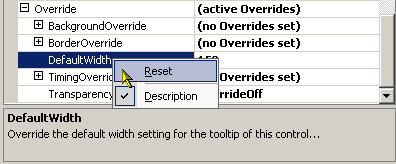
The "Reset"-command of the context-menu can also be applied to the expandable properties (BackgroundOverride etc.). This will reset all overridden layout properties of the selected object to "OverrideOff".
Most of the properties that come along with a dropdown-list in the property-grid offer the value "OverrideOff" in the dropdown. Most numerical values (like DefaultWidth etc.) can also be reset by entering "-1" or a value that is invalid for the specific property.
ToolTipsFactory layout override designer
A closer look to Picture 2 reveals that, if the Override-property is selected in the property-grid, a button with ellipsis appears in the value field. This indicates that a more sophisticated editor or designer is available to edit the Override-property. A click on this button will open the corresponding designer, which is discussed in detail in the section on the "ToolTipsFactory layout override designer".