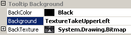
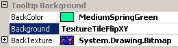
Gets or sets a value that specifies the image to be used to fill the tooltip background.
[Visual Basic]
Public Property BackTexture As Image
[C#]
public Image BackTexture {get; set;}
Property Value
Any bitmap image in a format supported by the .NET framework.
| Overridable |
Layout-file |
Property of | |||
| AnimationTT | ImageTT | SingleLineTT | MultiLineTT | ||
|
|
|
 |
 |
|
|
Description
This property holds the bitmap-image used to fill the tooltip background. It is only significant for layouts where Background is set to one of the Texture-related styles.If BackTexture is set to Nothing (no image) but Background=Texture..., the background will be filled with the color specified for BackColor.
In contrast to the Border- and the TextStyle-property, the Background-property supports an additional style (BackgroundStyle) to render textured backgrounds. With Background=TextureCenter the whole image assigned to BackTexture will be displayed in the center of the tooltip-background. The image will be isotropically scaled down in order to fit completely in the background-area. Usually, because of the different aspect ratios of tooltip and texture bitmap, this will lead to a small image at the center of the background leaving the rest of the background painted in solid color (BackColor). This is shown in the following sample for a MultiLineToolTip:
This background style makes only sense for Animation- and the MultiLineToolTips. It could be applied to SingleLineToolTips too, but usually this gives no satisfactory results.
The size of the image and the selected BackgroundStyle determine how the image will be drawn as tooltip background. If the image is smaller as the tooltip content size (that's the area of tooltip enclosed by the tooltip border), the image can be tiled by flipping the image in both X- and Y-direction (Background=TextureTile...), it can be stretched to fit the size of the tooltip content (Background=TextureStretch) or a preferred sector can be taken and enlarged (Background=TextureTake...). If the image is larger then the tooltip content, the image can not be tiled, it can only be stretched to fit the size of the tooltip content (Background=TextureStretch) or a preferred sector can be taken and resized accordingly (Background=TextureTake...).
Samples for some of the various options and combinations are shown below:
| Image larger as the resulting tooltip content (Landscape) | ||
| Background settings | Original image | Result |
|
|
(Size: 500 x 256) |
|
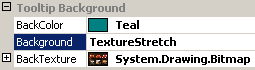
| Background=TextureStretch, forces the whole image to be displayed in as tooltip background. If the Width/Height-ratio of the tooltip and the image do not match, the image might get distorted (as in the example) because for TextureStretch the scaling is not done isotropically. | ||
|
|
(Size: 500 x 256) |
 |
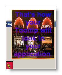
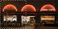
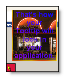
| Background=TextureTakeCenter calculates the largest possible viewport on the source-image with the same aspect ratio as the tooltip, places this viewport on the center of the image and takes this part of the image to fill the tooltip-background (scaling it appropriately). | ||
|
|
(Size: 500 x 256) |
|
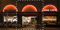
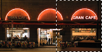
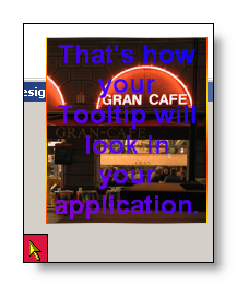
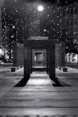
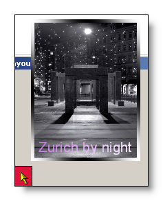
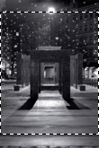
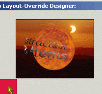
| Background=TextureTakeUpperLeft does the same as TextureTakeCenter but the largest possible viewport is positioned more on the upper left-side of the image. | ||
 |
(Size: 500 x 256) |
|
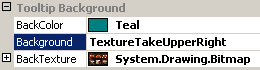
| Background=TextureTakeUpperRight positions the largest possible viewport on the upper right-side of the image. | ||

The samples show the situation for a source-image that is wider then high. For this kind of images usually it doesn't matter if TextureTakeUpper<position> or TextureTakeLower<position> (position=left or right) is selected, because the the tooltip component always tries to get the largest possible portion of the image that matches the aspect ratio of the tooltip, and for this it assumes the shorter side of the image (in this case the height) to fill the height of the tooltip and adapts the width of the selected viewport accordingly. Therefore it suffices to indicate the horizontal position of the viewport.
For images in portrait-mode (Height > Width) the reverse applies: For this images it is important to specify the vertical position (upper, middle, lower) in order to get the desired result: This is shown in the samples below:
| Image larger as the resulting tooltip content (Portrait) | ||
| Background settings | Original image | Result |
|
|
(Size: 2048 x 3072) |
|
| Background=TextureStretch, forces the whole image to be displayed as tooltip background. If the Width/Height-ratio of the tooltip and the image do not match, the image might get distorted (as in the example) because for TextureStretch the scaling is not done isotropically. | ||
 |
(Size: 2048 x 3072) |
|
| Again, Background=TextureTakeCenter takes the largest possible portion from the center of the image. | ||
|
|
(Size: 2048 x 3072) |
 |
| Background=TextureTakeUpper... shifts the viewport to the top of the image and takes this part to render the tooltip border. | ||
|
|
(Size: 2048 x 3072) |
|
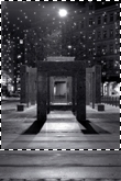
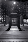
| Background=TextureTakeLower... takes the lower part of the picture. | ||
Above we discussed the texture-related BackgroundStyles that are applicable or have a visible effect if the image to be used as border-texture is larger as the tooltip. Because larger images can not be tiled, it wouldn't make much sense to apply one of the TextureTile...-BackgroundStyles. On the other hand, it wouldn't make much sense to apply one of the TextureTake...-styles to an image that is already smaller then the target-area. How the tooltip components handle images as background-texture which are smaller as the tooltip is shown in some samples below:
| Image smaller as the resulting tooltip | ||
| Background settings | Original image | Result |
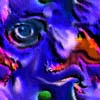
|
|
(Size: 100 x 100) |
|
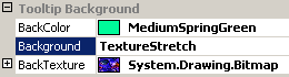
| Background=TextureStretch, forces the whole image to be displayed in the tooltip border. Because the image is much smaller then the resulting tooltip, the image is enlarged accordingly to fill the tooltip area. If the Width/Height-ratio of the tooltip and the image do not match, the image might get distorted because for TextureStretch the scaling is not done isotropically. | ||
|
|
(Size: 100 x 100) |
 |
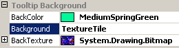
| Background=TextureTile
indicates that the image should be tiled in order to fill the background.
The border will only be tiled with the given image, if the image is
smaller then the resulting tooltip in one or both dimensions. If the given
image is larger then the tooltip, the tooltip background will be filled with
the image, but the result will be equivalent to the background created with
Background=TextureTakeCenter.
(This applies to all TextureTile...-styles.)
As can be seen from the result, the tiles are just laid out one next to the other. No measures have been taken to prevent possibly visible edges or abrupt transitions between the individual tiles. |
||
|
|
(Size: 100 x 100) |
|
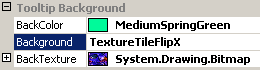
| Background=TextureTileFlipX does exactly what is says: It flips the tiles (the source-image) in horizontal direction. This results in smooth transitions between the tiles in one row. Probably sharp transitions from one row to the other are still visible. | ||
 |
(Size: 100 x 100) |
|
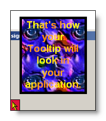
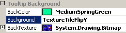
| In contrast to TextureTileFlipX, Background=TextureTileFlipY flips the tiles in vertical direction but not horizontally. Now this makes smooth transitions between the rows, but possibly the edges between the tiles in a row are again visible. | ||
|
|
(Size: 100 x 100) |
|
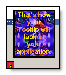
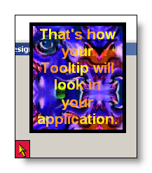
| Background=TextureTileFlipXY finally makes sure that no edges are visible between the tiles, because the tiles are flipped vertically and horizontally. | ||
A point to take into account, when using large bitmaps (like photographies) as backgrounds, is the dynamic adaptation of the tooltip size according to the content to be displayed for the different controls on the form (as shown in the samples above). This makes it difficult to predict or make sure that a given combination of BackTexture and tooltip content always looks as expected.
The easiest way to use textured backgrounds is to use small bitmaps with nice patterns which are designed to be used as tiled background.
Larger images, with significant or decorative content that should absolutely not be stretched or tiled, can also be easily used as background (as show in some samples above), but in this cases you should carefully choose the DefaultWidth, the BorderWidth and - if appropriate - the FontSize. For static tooltip content (the content is directly assigned to the control on a form through the property-grid in Visual Studio) you should make sure that the tooltip looks good for each control that uses this specific tooltip layout by testing it in the "Override layout designer". For dynamic tooltip content (assigned at runtime), your code has to take care that the text dynamically displayed by the tooltip does not exceed or fall below a certain length that could compromise the - desired - appearance of the tooltip border.
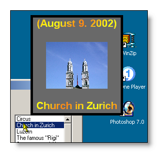
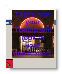
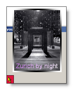
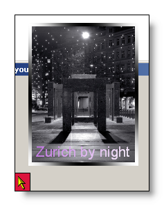
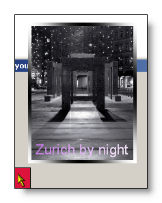
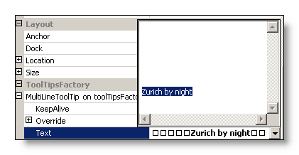
If larger images are going to be used as background for the MultiLineToolTip and central parts of the image should always be visible, the MultiLineToolTips offer an easy way to gain some control over the height of the tooltip (and therefore the aspect ratio) of the resulting tooltip. Usually the MultiLineToolTip adapts it's height according to the current content and the defined DefaultWidth, Font-size and the setting of the AutoSize-flag. By using the possibility of the MultiLineToolTip to accept multiple lines as content, the height of the tooltip can be influenced by entering leading and trailing empty lines to increase the height of the tooltip and to display the (visible) content at the desired vertical position. E.G., this can be used to move one single row of text to the bottom of the (background) image as is shown in the example above with the "Zurich by night"-photography. The content for the tooltip was specified as follows in the property-grid:
SingleLineToolTips are less useful to combine significant background-images and textual content because the aspect ratio of SingleLineToolTips is usually not suitable to display any meaningful image. But of course they can be rendered with nice tiled patterns.
The AnimationToolTip also offers all properties to define the layout of the background, even if in most cases the background will not be visible. This is the case for all animations (the tooltip-content) that do not use transparency. The defined background only comes into play when the Animation itself has a transparent background or uses semi-transparent frames. In this cases the background defined for the tooltip will become fully visible or at least shine through the animation as shown below:
 |
 |
Other important aspects to be considered when using textured background are the dimensions and the size of the used bitmaps. The dimensions of the used bitmap are important because they have an impact on memory-usage and performance. Of course it is perfectly possible to use images with millions of pixels. But images with this dimensions do not make much sense, if they are going to be shown in a tooltip which is only 200 to 500 pixels wide. The details of such high-resolution images get lost anyway in the process and the bitmaps just consume a lot of memory. This and the internal downscaling of the images are also notable in terms of performance. It will probably take much longer for the tooltip to pop-up, when over-dimensioned bitmaps are used as with appropriately sized images. The file-size of the images is important because it has a direct impact on the size of the compiled executable. Any image assigned to BackTexture at design-time will end up as a resource in the compiled application. Therefore it should be avoided to use multi-megabyte image-files as textures, if you don't want your executable to inflate like a balloon. You should also keep in mind, that high-resolution images, which maybe are not that big as files, because they are highly compressed JPEG-files, need to get decompressed and end up using quiet a lot of RAM as Image-objects in your application (e.g.: a 400k JPEG-image with 1536 x 2048 pixels uses up to 10 mb of RAM when residing in memory as a bitmap).
There are no golden rules on how to address this issues. The ToolTipsFactory tooltips are definitely able to handle even very large images and you are free to use them if really necessary. But in general it is better to scale the images down to a size that is in the range of the expected or desired tooltip-size. A pragmatic approach that gives good results in terms of quality, memory-usage and size is to proportionally scale down the images to a size where the number of horizontal pixels is two to three times the value set for DefaultWidth. This way, the size of the images is substantially reduced, but it still gives good results even if the size of the tooltip is slightly increased by changing the DefaultWidth, the FontSize (if applicable) or by the dynamic adaptation of the tooltip-size to different content.
If specified at the component-level for a tooltip component (i.e. by defining the BackTexture directly for the component), the assigned image will become the default BackTexture for the tooltips of all controls on the same form:
'Assign a new image to be used for a textured tooltip background
'to the tooltip component
Me.MultiLine.GetMultiLineToolTip(Panel1).BackTexture = _ Image.FromFile("C:\Temp\Eclipse.jpg")
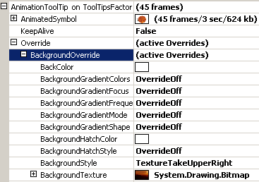
This default BackTexture can be overridden for each control through the Override-property provided to all controls on the same form by the tooltip component (see "The Override-Property").
If the override-value for the BackTexture has to be set or changed at runtime for the tooltip of a specific control, code like the following is needed:
'Assign a new image as texture for the tooltip background
'to the override-object for Panel1
Me.MultiLine.GetMultiLineToolTip(Panel1).Override _
.BackgroundOverride.BackTexture = Image.FromFile("C:\Temp\Eclipse.jpg")
Example 1
This statements define a textured background at the component level:
'define a textured background for the tooltips provided by the component (MultiLine).
Me.MultiLine.Background = BackgroundStyle.TextureTakeCente
'load the image and assign it to the BackTexture property...
Me.MultiLine.BackTexture = Image.FromFile("C:\Temp\logo.jpg")