Gets or sets a value which defines the width for the tooltip content in pixels.
[Visual Basic]
Public Property DefaultWidth As Integer
[C#]
public int DefaultWidth {get; set;}
Property Value
Any positive Integer value.
| Overridable |
Layout-file |
|
|
|
|
Description
This property defines the width of the tooltip content. It applies to all tooltips of the ToolTipsFactory family, but it is differently applied by each kind of tooltip according to the type of content to be displayed. The following table describes the different semantics of the DefaultWidth-property for each tooltip component:
| Component | Description | |
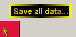
| ToolTipsFactorySingleLine | The SingleLineTooltips show
their content (obviously) as one single line of text. The theoretical
width of the rendered text in the tooltip depends on the text to be
displayed and the font-settings. The DefaultWidth determines
the maximum width of the rendered text. This means, only as much of
the text is rendered as fits in the width defined by DefaultWidth.
If the text exceeds this limits, it will be truncated and the
truncation is made visible by an ellipsis (...), as shown in Picture
1.
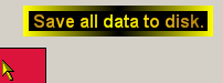
Now, the DefaultWidth is only applied if the AutoSize-property is set to False. If AutoSize=True, the full text will be rendered as long as it does not exceed the limits given by the screen-resolution (see Picture 2). |
|
 (Picture 1) |
 (Picture 2) |
|
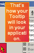
| ToolTipsFactoryMultiLine | This component handles slightly
different then the SingleLineToolTip-component. Again, the
DefaultWidth is applied only if AutoSize=False.
In this case, the tooltip text will be forced in to this horizontal
limits, but the text is wrapped into as many lines as needed - i.e.
the vertical tooltip size is dynamically adapted (see Picture
3). It should be noted, that the wrapping happens at the
character-level, which seldom leads to acceptable results.
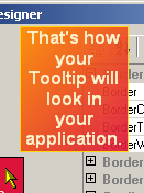
With AutoSize=True, the text is also wrapped and the tooltip-height dynamically corrected. The difference to the SingleLineToolTip is that this time word-wrapping is used. The tooltip takes into account the defined DefaultWidth and tries to wrap the text within this boundaries. But if there is a single word that exceeds the DefaultWidth, the tooltip-width is dynamically expanded to fit the longest word in one line (see Picture 4). |
|
 (Picture 3) |
 (Picture 4) |
|
| ToolTipsFactoryImage | The ImageToolTip-component does always use the value defined as DefaultWidth. The ImageToolTip uses the DefaultWidth as a reference value to scale the image to fit the desired tooltip size. According to the orientation of the image (Portrait or Landscape) it always takes the longer image side to be scaled to the value defined as DefaultWidth. In other words: For images wider then high (landscape), the width of the image is scaled exactly to DefaultWidth and the height accordingly adapted (see Picture 5), while images higher then wide (portrait), the images will be scaled to a height of DefaultWidth and the width accordingly adapted (see Picture 6). The following samples illustrate this behavior. Both samples have been created with DefaultWidth=120: | |
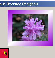 (Picture 5) |
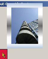 (Picture 6) |
|
| ToolTipsFactoryAnimation | The AnimationToolTip-component has always the width assigned to DefaultWidth. The movie-clip and all it's frames are scaled down and the tooltip-height adjusted accordingly. This is shown with the following samples, where DefaultWidth=15 (Picture 7) and then increased to DefaultWidth=30 (Picture 8). | |
 (Picture 7) |
 (Picture 8) |
|
Setting DefaultWidth=0 turns the component off and no tooltips will displayed for controls which have content specified for the specific tooltip (for tooltips with AutoSize-property, AutoSize must be set to False, to turn off the tooltip-display this way).
If specified at the component-level for a tooltip component (i.e. by defining the DefaultWidth directly for the component), the assigned value will become the default DefaultWidth for the tooltips of all controls on the same form:
'Assign a new default-width to the tooltip component
Me.MultiLine.DefaultWidth = 150
This default DefaultWidth can be overridden for each control through the Override-property provided to all controls on the same form by the tooltip component (see "The Override-Property").
If the override-value for the DefaultWidth has to be set or changed at runtime for the tooltip of a specific control, code like the following is needed:
'Override the default tooltip content-width for the tooltip
'of Panel1...
Me.MultiLine.GetMultiLineToolTip(Panel1).Override.DefaultWidth = 300