Gets or sets an array of colors used to create the linear gradient for tooltip border.
[Visual Basic]
Public Property BorderGradientColors As Color()
[C#]
public Color[] BorderGradientColors {get; set;}
Property Value
An array with two or more colors. Color.Transparent is not supported and will be rendered as LightYellow.
| Overridable |
Layout-file |
|
|
|
|
Description
This property defines the colors to be used to render the tooltip border with a linear gradient. They are only used if the BorderStyle assigned to the Border-property is set to LinearGradient and BorderWidth is > 0.The easiest way to define the colors for a linear gradient border is to use the Visual Studio property-grid, the interactive "ToolTips Layout Designer" or the "ToolTips Layout Override Designer".
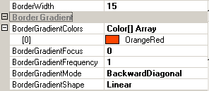
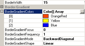
The BorderGradientColors-array presents itself the same way in the normal Visual Studio property-grid and in the property-grids of the the two designer's. In the collapsed state it looks like this:
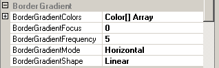
Picture 1
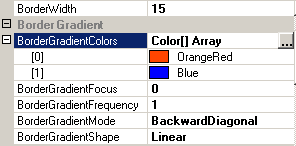
If the BorderGradientColors-property is expanded in the property-grid, the items contained in the array will become visible:
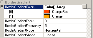
Picture 2
The listed colors can be changed directly inside the property-grid as any other color-property. A click in one of the array-items activates the property-editor, which lets you enter any valid color name:
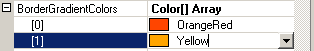
Picture 3
As the little button on the right edge of the item-property indicates, there is also a drop-down list available to select the desired color. A click on the button brings up the classical color-picker, which makes the color-selection easier:
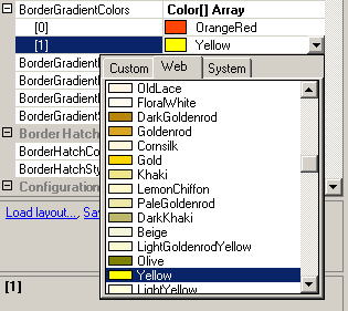
Picture 4
What you can not do directly in the property-grid is to add or remove colors from the BorderGradientColors-array. To do this, the property-editor for the BorderGradientColors-property has to be opened. That there is one available, becomes visible as soon as the property is selected in the grid and a button with ellipsis appears on the right edge of the property (see Picture 2). A click on this button opens the corresponding "Color Collection Editor":
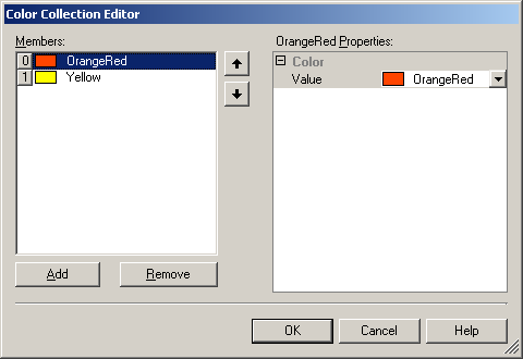
Picture 5
Here it is possible to add, remove, edit and reorder the colors in the BorderGradientColors-array.
The rendering of linear gradients is influenced by many other properties that can be configured independently. The property-grid groups this properties in the category "Border Gradient" (see Picture 1). Because the number of possible combinations of all this settings exceeds the scope of this reference manual, only the effect of the number of chosen colors for the linear gradient will be discussed in this section, while the other settings remain in their default state.
The following table gives an idea about how the number of colors can influence the look of the linear gradient border:
| BorderGradient settings | Result | Description |
 |
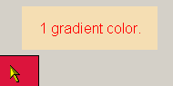 |
This is a case which should be avoided! This situation can only arise if the number of colors is manually reduced to less then two. By default, the BorderGradientColors-array is initialized with two identical colors, because at least two colors are needed to render the gradient. Therefore, a state where the array contains less then two colors is an error condition. The tooltip components handle this situation gracefully and create a solid border with the color assigned to the BackColor-property. |
 |
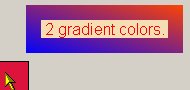 |
This is shows a linear gradient border with two colors. |
 |
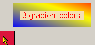 |
The same settings as above but with a third color inserted. |
If specified at the component-level for a tooltip component (i.e. by defining the BorderGradientColors directly for the component), the assigned array of colors will become the default BorderGradientColors-array for the tooltips of all controls on the same form. This default BorderGradientColors can be overridden for each control through the Override-property provided to all controls on the same form by the tooltip component (see "The Override-Property").
If the override-value for the BorderGradientColors-array as a whole has to be set or changed at runtime for the tooltip of a specific control, code like the following is needed:
'Assign a new the color-array (newColors) to the override-object for Panel1
Me.MultiLine.GetMultiLineToolTip(Panel1).Override _
.BorderOverride.BorderGradientColors = newColors
Example 1
This statements define a linear gradient border and change the individual colors of the BorderGradientColors-property at the component-level:
'define a linear gradient border for the tooltips provided by the component (MultiLine).
Me.MultiLine.Border = BorderStyle.LinearGradient
Me.MultiLine.BorderWidth = 5 'make the border 5 pixel wide
'assign the start-color...
Me.MultiLine.BorderGradientColors(0) = Color.Red
'...and the end-color for the gradient.
Me.MultiLine.BorderGradientColors(1) = Color.Blue
Example 2
This code creates a new color-array,
initializes it with the desired colors and assigns it to the Override-object:
Dim newColors(2) As Color 'Declare a color array for two colors
newColors(0) = Color.Green 'Assign the first color...
newColors(1) = Color.Yellow '...and the second color to the array.
'Assign the array to the override-object for Panel1
Me.MultiLine.GetMultiLineToolTip(Panel1).Override _
.BorderOverride.BorderGradientColors = newColors