The second part of the Quick start tutorial focuses on the MultiLineToolTip component. We will design a default layout for the MultiLineToolTips on the form an add such a ToolTip to a control on the main form of the sample program. This part assumes that the reader has followed Part I of the tutorial.
Step 1 - Configure the layout of the MultiLineToolTip component
- Open the project created in Part I of the tutorial and open Form1 in design mode.
-
Select the MultiLineToolTip (ToolTipsFactoryMultiLine1)
in the component tray of Form1.
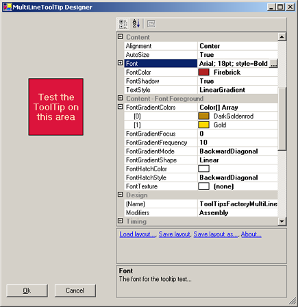
- Double-click the selected component in order to open the MultiLineToolTip-Designer and scroll the property-grid to the Content-category.
-
Set the values of the "Content-" and
"Content - Font foreground"-properties as shown in
the next image:
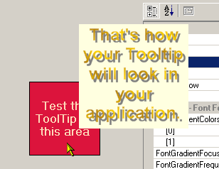
With this font and content settings the ToolTip should show the text horizontally centered and - because of the shadow - somehow floating over the background of the ToolTip. The text is rendered as a repeating linear gradient. As you already know, you can test the current settings if you move the mouse pointer over the red test-area. If you entered the values as suggested, you should see the following ToolTip appear:
-
Now, this looks nice, but is not yet, where we want to
go today. The good old Retro-Look (the light yellow background)
is still shining through. What we want to do, is something that looks
really cool. The ToolTipsFactory gives us the possibility to turn our nice
design into a real cool one with just two mouse-clicks.
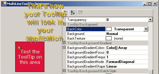
To do this, scroll the property-grid down to the "ToolTip Background"-category and change the BackColor-property to "Transparent". (The color "Transparent" can be found in the "Web"-Tab of the color-picker.)
If you test the ToolTip now, you should see just the text floating over the Designer:
-
Definitely, this looks cool but it would be much
cooler, if we could make the ToolTip glide over the control
instead of having it suspended at mid-air.
Well, as a car factory provides the cars with engines to make them move, the ToolTipsFactory is capable of providing the ToolTips with their own kind of engine to make them mobile. The ToolTips-Designer (i.e. you, the application developer) just has to order this feature at design-time.
To do this in our sample, just look for the FollowPointer-property and set it to "True".
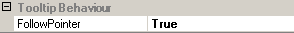
If you test the ToolTip after this change, you'll see that the ToolTip now smoothly follows the mouse pointer as you move it over the test-area. I.e., what you really see, is the text silently gliding over the surface of the ToolTip-designer....
Step 2 - Save the layout for future use
- After having designed such a cool layout, you maybe want to reuse it in other projects or other forms as well. It would be annoying if one has to manually enter all the values again and again. To avoid this kind of repetitive tasks, the ToolTipsFactory designers provide functions to save and load layouts.
Maybe you have already noticed the three blue labels in the designer that are right below of the property-grid, and correctly suspected that they serve exactly this purpose.
If you want to save the current layout, just click on the "Save layout"-label. This should open a File-Selection dialogue.- In the file-selector navigate to the directory where you want to save your layout and enter a name for the file (e.g. "FloatingTextGold").
- Save the layout to the designated File by activating the "Save"-button.
- Close the MultiLineToolTip-designer by clicking the "Ok"-button. This will commit the changes to the component. If you cancel the designer, all changes will get lost.
Step 3 - Assign MultiLineToolTip content to controls on the form
- As you remember from Part I of the tutorial, the ToolTip-content for controls on a form is provided through extended properties. Now, if we want to make real use of our cool design, we have to enter some text in the MultiLineToolTip extended property of at least one control on the main form.
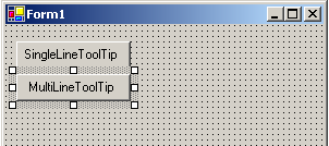
For this, we first add a new button control (Button2) to the the form as shown in the image below:
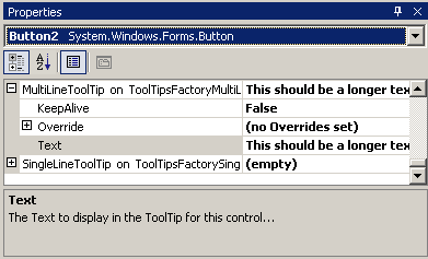
- Then we select Button2 and go to the provided MultiLineToolTip property (MultiLineToolTip on ToolTipsFactoryMultiLine1) in the main property-grid. As in the previous lesson with the SingleLineToolTip, we have to expand this property to get access to the nested property where we can enter the text:
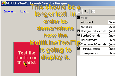
(The text entered for this example is: "This should be a longer text, in order to demonstrate how the MultiLineToolTip is going to display it.").- To test the ToolTip for Button2 with the provided text, we should activate the layout override-designer as shown in the previous lesson for the SingleLineToolTip. If you entered the same text and have defined the same layout as shown in the steps above, you should see something like this: