The first part of this Quick start tutorial is quiet
descriptive. It shows how to create the example project, and how to add the
ToolTipsFactory components to it. It then leads through all the steps needed
to design a new layout for the ToolTipsFactory SingleLineToolTip and how to
use the component on a windows form.
Because the steps showed in this part are common to all ToolTipsFactory components, they are explained in more detail. The key concepts on how to use the ToolTipsFactory at the "point & click"-level should be clear after reading this part.
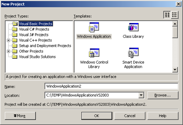
Step 1 - Create a new Windows Forms project
-
Start Visual Studio and create either a new VB or C# Windows Forms project:
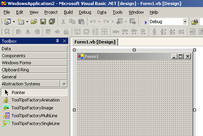
Step 2 - Add ToolTipsFactory components to the form
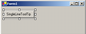
- Open the created form (if it's not already open), go to the Toolbox and open the "Abstraction Systems"-Tab.
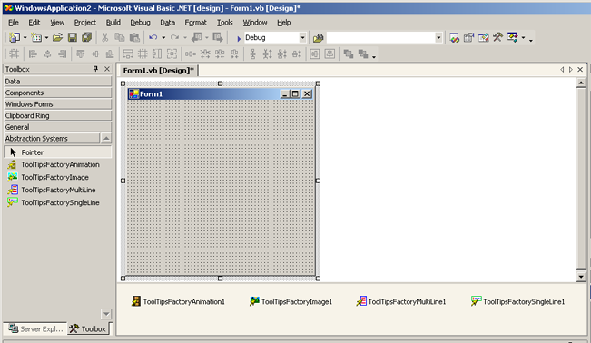
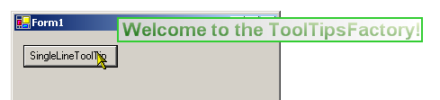
If the ToolTipsFactory was correctly installed, you should now see the four ToolTipsFactory components in the 'Abstraction Systems'-Tab.- Now you are ready to drag one ore more ToolTipsFactory components to the form. For this tour we are going to add all four kinds of ToolTips to the form (we want to see 'em all in action...). After having placed all four ToolTip components in the component tray of the form, the forms designer with your open form should look like this:
Step 3 - Configure the layout of the ToolTipsFactory components
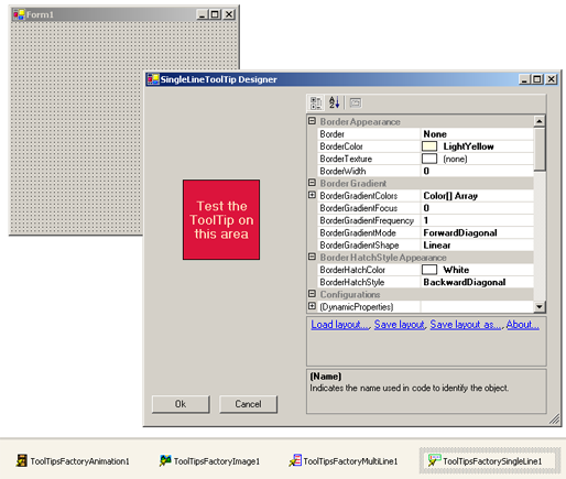
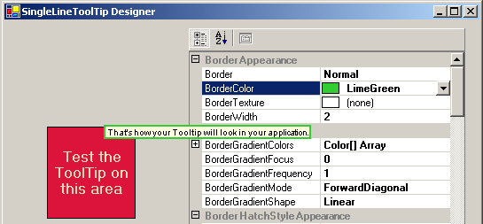
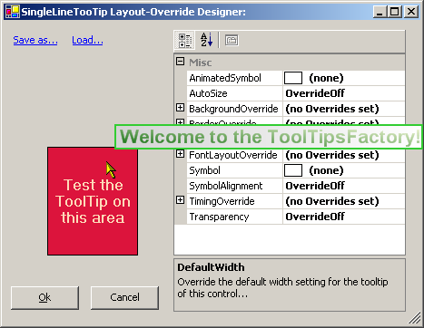
- By default, the ToolTips have the same look as the classical ToolTip control. Of course you did not get a license for the ToolTipsFactory just to get the good old "Retro-Look". So the first thing we are going to do, after adding the component to the form, is to define the default ToolTip-layout for the specific component. In order to do this, you can select the component in the component tray and then either go to the property-grid to edit the layout or double-click the component to open the associated designer. The following image shows the "ToolTip layout designer" for the SingleLineToolTip (ToolTipsFactorySingleLine1):
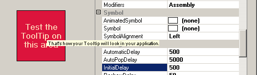
- Except for one useful difference, the ToolTip designer provides exactly the same properties in it's property-grid as the main Visual Studio property grid does. The designer is useful whenever you want an instant feedback on how your changes on the ToolTips properties affect it's appearance. To see how the ToolTip behaves and looks like with the current settings, just move the mouse pointer over the red area on the left side of the designer. The ToolTip will pop-up after a short delay (as defined by the InitialDelay-property). If we do this while the properties are still in the default state, we get the following result:
As said before, the default appearance of the ToolTipsFactory ToolTips is a complete understatement and definitely not what we want. So the next step will be to bring some more color and other improvements into this light-yellow world.- The first thing we have to decide is if we want a border to be drawn or not and what kind of border this should be. For this example we decide to draw a solid border and ignore the other possible border types. To make the SingleLineToolTip draw a solid border we have to go to the Border-property in the property-grid and change it's value from "None" to "Normal". Next we have to define a width for the border and set the BorderWidth-property to "2". And, last but not least, we definitely should change the BorderColor from "LightYellow" to a more fashionable color. Depending on the selected color, the result - when testing the ToolTip over the red area - should look somehow like on the next image:
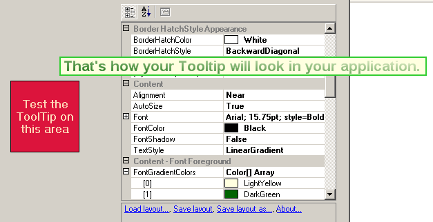
- Well, this looks nice, but it still can't hide it's roots. The background color is the same pale yellow as in the classical ToolTips and also the font size makes the use of a telescope inevitable, if we want to know what the ToolTip it is telling us. Now, before we start to change the background, we should define the font and the font appearance. To do this, we scroll the property-grid to the Content-category:
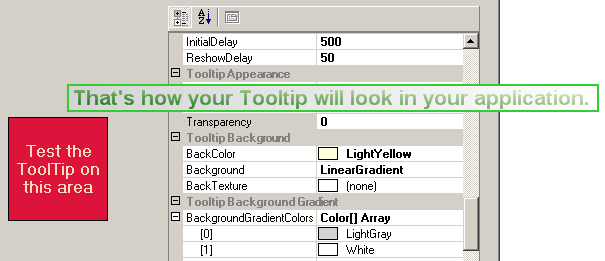
As you can see in the image above, we changed the font size to 16 points, bold style. The value of the TextStyle-property is set to "LinearGradient" in order to get the text rendered with a linear gradient. The two colors for the linear gradient (more then two colors are possible) were set to "LightYellow" and "DarkGreen". As you see, the look of our ToolTip is now miles away from the classical ToolTip. The font has a comfortably readable size and the overall appearance changed from 'boring' to at least 'nice'.- Before we are finished, we have to get rid of the last remnant of the classical ToolTip look and therefore give the ToolTip's background our personal touch. For this we scroll into view the property-grid categories "Tooltip Background" and "Tooltip Background Gradient" and set the appropriate values. The background we propose for this example and the according values are shown in the following image:
The value of the Background-property is set to "LinearGradient" and the colors in the "BackgroundGradientColors"-list are set to "LightGray" and "White".
Step 4 - Assign ToolTip content to controls on the form
- With the steps above, we just defined the default layout for the SingleLineToolTips on our form. This alone is not enough to make them appear, when the mouse pointer is hovering over one of the controls on the form. Maybe you have noticed, that there is no property where you can assign the text to be displayed. So the question is now, where can we specify the actual content for the ToolTip? Now, if you have ever used the classical .NET ToolTip control, you know that the text to be displayed for a specific control has to be defined in the property-list for that control. This is achieved through so called extended properties. This is a mechanism, where a component provides one or more properties to other components or controls. This extended properties appear in the property-list of the controls that have been extended.
The ToolTipsFactory components do exactly this: They provide all controls on the form, where the component is placed, with a property where the content for the ToolTip on that control can be assigned.
In order to test our new ToolTip design in a compiled program, we first need to put a control on our form and define the text that should be shown by the ToolTip, when the pointer moves on that control. In this case we'll place a button (Button1) on the form:
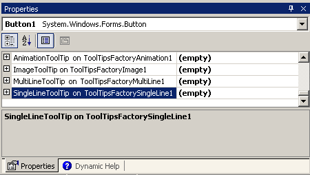
- To enter the text that should be displayed as a ToolTip when the mouse circles over the new button, we select the button and in the main Visual Studio property-grid we scroll to the bottom of the property-grid, where we should find the extended properties provided by the four ToolTipsFactory components placed on the form:
- The first two things you'll notice are the fact, that the extended properties are really there and that they all show "(empty)" as value. This indicates, that all of the tooltips are disabled for the selected control (in our case Button1). They get only enabled, as soon as they have content provided to display.
As you can see in the property-grid, the extended properties are expandable properties and - if you try - you'll notice that the values can not be changed.
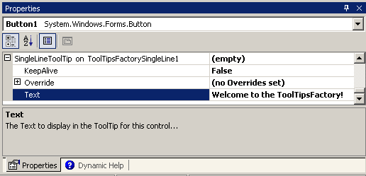
To get access to the property, where the actual content for the SingleLineToolTip can be assigned, we have to expand the property (SingleLineToolTip on ToolTipsFactorySingleLine1) . To do this just double-click on the property name to get the nested properties as shown in the image below:
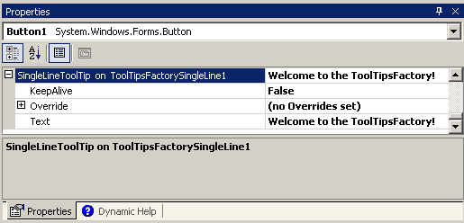
- Go to the Text-property and type in the text you want to display when the mouse hovers over Button1. If you leave the field after entering the text (this commits the change) and click on the root property (SingleLineToolTip on ToolTipsFactorySingleLine1), you'll see that the value "(empty)" of the extended property now reflects the current content for the ToolTip on Button1:
Step 5 - Many ways lead to Rome
- After having put to place everything and having defined a nice layout for the SingleLineToolTips on the form, we want to see how it looks like in the running application. One way to do this, is to compile the program and run it. In Visual Studio this is usually done by pressing [F5]. This compiles the current project and starts the compiled program. If the program is free of any build errors (it should be, because we haven't coded anything yet), the main form of the example program should appear and you can move the mouse over that lonely Button1 and see what happens. The result should look this way:
- If you are just interested to see how the ToolTip looks with a specific content, without having to recompile the program, there is another faster way to get there.
After you have defined the content (see Step 4 - 4), you can click the value field of the Override-property. With the cursor placed in the textbox, the Override-property should show a small button on the right side with an ellipsis:
If you click this button, a new window opens which looks really similar to the ToolTips-designer and which provides almost the same functionality. As in the normal ToolTips layout designer, you can move the mouse pointer over the test-area and the ToolTip will pop-up. The difference to the main ToolTip-designer is that the ToolTip now shows the content assigned to the selected control (in our case, Button1):
As you can see, the resulting ToolTip looks identical to the compiled version. So this is usually the fast track, to check the tooltip for a specific control. There's no need to compile and run the program.
Summary - Part I
In this chapter you learned how to add the ToolTipsFactory components to a windows forms project and the basic steps of how you can design and test your own layouts with the provided designers. The procedures explained in this chapter apply to all ToolTipsFactory components.
Please note: This chapter did not provide an in-depth discussion of all the properties exposed by the components and how they are best used. There is much more to be known, if you want to take full advantage of the possibilities inherent in this components. This more exhaustive information is provided in the reference and tutorial chapters of this document.
What's next?
In this part of the Quick start tutorial we have designed and added a SingleLineToolTip. In Part II we will design and use a MultiLineToolTip.