The last part of the Quick start tutorial
concentrates on the AnimationToolTip component. We will quickly design a default layout for
the AnimationToolTips on the form and again add such a ToolTip to a control on the
main form of the sample program. Of course this steps will not be explained
anymore, because we already know all that. The main task in this tutorial will
be to figure out, how we can load existing animations and assign them to the
extended ToolTip-property of a control, and we'll learn how to create our own
movie-clips with the help of the ToolTipsFactory Animation-Editor.
This part assumes that the reader has
followed Part I, Part
II and Part III of the tutorial.
Step 1 - Configure the layout of the AnimationToolTip component
- This time, the default layout we need, is quickly configured. What we want is a red border, a gradient background and a fix width of 50 pixels. For this we have to set the following values in the property-grid:
- Border = Normal
- BorderWidth = 1
- BorderColor = Red
- Background = LinearGradient
- DefaultWidth = 50
- If we test this settings in the AnimationToolTip layout designer, the result should look like in the image:
Please note: The animation you see in the AnimationToolTip layout designer is provided by the designer itself. This animation will not appear in your application.
Step 2 - Assign AnimationToolTip content to controls on the form
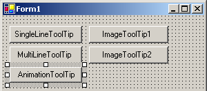
- The next step will be to make a control on our main form display an AnimationToolTip. For this we proceed exactly as in the previous parts. First we add a new Button (Button5) (or any other kind of control) to the form as shown below:
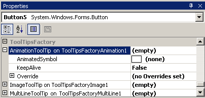
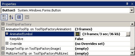
- In the Visual Studio property-grid we scroll down to where the provided properties for Button5 are located and expand the "AnimationToolTip on ToolTipsFactoryAnimation1"-property:
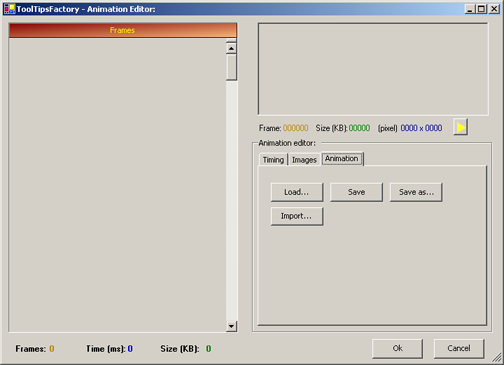
- Now we have to load an animation into the "AnimatedSymbol"-property. We do this by clicking into the property and click on the small button with an ellipsis that appears on the right side. This does not open a file-selection box as it was the case for the provided ImageToolTip property. Instead the ToolTipsFactory Animation-Editor will be opened. This Animation-Editor provides us with (almost) everything we need, to create, edit and load and save ToolTipsFactory animations.
For the moment we will limit us to load an existing Animation to be displayed in the ToolTip for Button5. In order to access the functions to load and save Animations, we have to select the "Animation"-Tab in the Animation-Editor window, as shown in the following image:
- To load an existing animation we have to click on the "Load..."- button, which will open a file-selection box, where we can browse for the ToolTipsFactory-Animation we want to assign to Button5. Again we navigate to the directory where the ToolTipsFactory is installed and from there down to ".\Animations" directory.
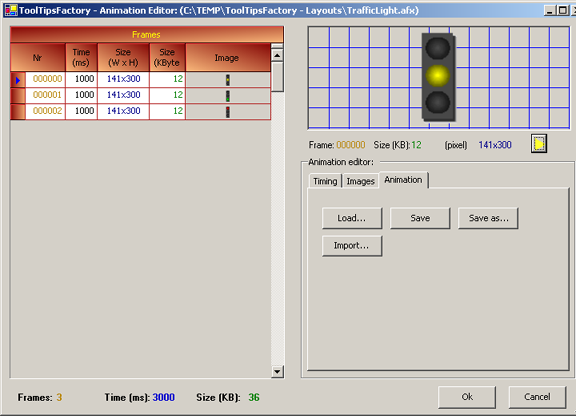
- In this directory we select the Animation-file named "TrafficLight.afx" and open it. The file will be loaded and the animation-frames should appear in the "Frames"-list on the left side of the Animation-Editor, as the next image illustrates:
As you can see, the loaded animation consists of only three frames. When the animation is played, each frame will be shown for 1 second (1000 ms). The original size of the frame-images are 141x300 pixels. This dimensions are not that important, because the AnimationToolTip will always correctly scale the animation frames to the width specified in the DefaultWidth-property. But this value can tell us, that we wouldn't get a better image, if we make the DefaultWidth of the ToolTip wider then the average frame width. The other way around, it will not make sense to have huge frames (e.g. 640x480 pixels) if all we want is a ToolTip that is 120 pixels wide. This would only adversely affect performance and program size.- To see how the animation looks, when it is animated, you can click on the "Play"-button right under the preview window on the right side of the Animation-Editor. This should make the Traffic-Light change it's state every second, with the following sequence: starting with yellow, changing to green then red and back to yellow again.
- If we are satisfied with the result (we are!), we close the Animation-Editor by hitting the Ok-button. This will make this animation the animation displayed in the AnimationToolTip for Button5. The property-grid should reflect this as shown in the image below:
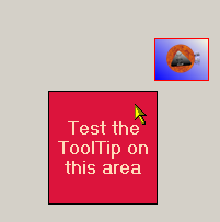
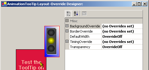
- If we want to see, how the loaded animation looks inside the ToolTip with the layout we have defined for the AnimationToolTip component, we open the Layout override-designer (accessed through the Override-property) and make the ToolTip appear over the test area. The result should look like this:
Step 3 - Create a new Animation from scratch
- In Step 2 we learned how we can load existing ToolTipsFactory Animations. Now we are going to create our own movie-clip from scratch. As we saw above, the ToolTipsFactory comes with a quite powerful Animation-Editor. The idea of this editor is to easily assemble movie-clips from existing images. This means that the editor is not thought to replace painting- or drawing tools like Photoshop, PaintShop Pro etc. It's main intent is to import images from different formats and sizes and to let you build a smoothly running movie-clip to be played in either the AnimationToolTip or in the SingleLineToolTip component.
The consequence of this is, that we first have to draw (or find) the images, which should be used as frames in the Animation we are going to build.
For this tutorial we are going to take already prepared images in order to introduce the concepts for building animations with the ToolTipsFactory Animation-Editor. (How to paint and draw, is definitely not the subject of this manual.)
The two images, we are going to use, were drawn with a simple painting program and it took only five minutes to create both of them. In the following steps we'll see, how we can make a nice animated symbol with just this two images:
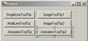
Frame 1 Frame 2 - Our goal for this exercise will be to create a short movie-clip, with a blinking exclamation-mark. But before we start we should create a new control (Button6) on the form, where we can then assign the finished animation as ToolTip-content. So let's put this button into place:
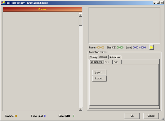
- The next step is to scroll down to the provided AnimationToolTip-property of Button6 ("AnimationToolTip on ToolTipsFactoryAnimation1") and, by clicking into the Animation-property, open the Animation-Editor. In Step 2 we had to select the "Animation"-Tab, because we wanted to load a complete animation. Now we want to access the functions to load and save individual images, which leads us to the "Images"-Tab in the Animation-Editor window, as shown in the following image:
- This Tab offers the choice to either import or export images (Frames). Because there is not much to export yet, we'll hit the import-button. This opens the well-known file-selection dialog for us, where we can browse for the images we want to import.
- Again we navigate to the directory where the ToolTipsFactory is installed and from there down to ".\Images" directory. In this directory we select the two image-files "ExclamationMark_Frame1.png" and "ExclamationMark_Frame2.png" and open them:
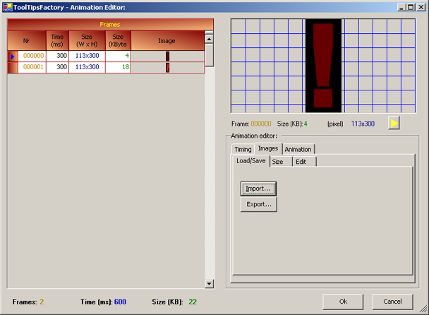
As you can see, the two images were loaded into two frames of the Animation. Therefore our animation now consists of two frames. As you can also see from the Time-column in the grid, each frame will be displayed for 300 milliseconds.
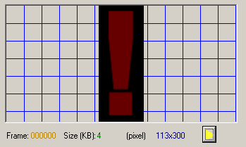
- Well, basically our Animation is ready for use now. All we have to do now, is to see whether we like the blinking effect (determined by the display-time of the frames) or not. To test the animation, we just need to click on the "Play"-button right under the preview window on the right side of the Animation-Editor. The result should look like in the following image (here it plays endlessly, but in the editor it runs only once per click on the play-button):
- If the blinking frequency is not what we wanted, we could fiddle around with the display time of the frames until we get the desired result.
- If we are satisfied with the complete animation we should save it to disk before we close the Animation-Editor. This way, we can also use it in future projects. To save the animation we click on the "Animation"-Tab and from there we proceed by hitting the "Save..."-Button.
- The last step now will be, to close the Animation-Editor with a click to the "Ok"-button. This assigns the new animation to the property provided to Button6 by the AnimationToolTip.
- As in with the other ToolTips, we have now two choices to see the AnimationToolTip for Button6 in action: We can open the layout override-editor of the extended property of Button6, or 2. we can compile and run the project and in the running program hover the mouse over Button6 (AnimationToolTip2).
Summary - Part IV
In this chapter we learned how to load and use the AnimationToolTip component. We also saw, how we can load existing ToolTipsFactory Animation-files and create and edit our own animations with the help of the Animation-Editor.
Conclusion
This tutorial should have provided you with a good overview of the capabilities of the ToolTipsFactory components and on how to use them in your application. By now, you will have grasped the point, that the ToolTips can completely be designed and configured interactively. So even if we didn't discuss all the properties there are, you can safely play around with all properties and see what happens. The worst thing that could happen to you with this kind of experiments is, that the ToolTips look ugly or do not behave as you might want them to. On the other side: This kind of playing around with the ToolTip-properties is likely to lead to new interesting designs....
Of course this was only a short tour, so a lot of interesting or useful information has been omitted. More in-depth information can be found in the reference sections of this documentation.
The focus of this tutorial was more on the "point & click"-use of the ToolTipsFactory components. This will suffice for most applications of the ToolTips. For more sophisticated usage of the ToolTips and on how to work with the components at the programming level, you can consult the Reference Manual or the Task-based Tutorial. You should specially have a look at the Task-based tutorials in order to see all the interesting - not trivial - things you can do with the ToolTipsFactory components.