![]()
Gets or sets a value that specifies the shape to be used to create the transition from the start color of the gradient to the end color.
[Visual Basic]
Public Property BorderGradientShape As GradientShape
[C#]
public GradientShape BorderGradientShape {get; set;}
Property Value
Any value of the GradientShape-enumeration. Default value is GradientShape.Linear
| Overridable |
Layout-file |
|
|
|
|
Description
This value defines the shape to be used to render the transition from the start to the end color of the linear gradient used to paint the tooltip border. It is only significant for layouts where Border=LinearGradient.The selected shape defines how fast the starting color is blended into the ending color along the path of the gradient. The gradient can be imagined as a hill, where the GradientShape represents the slope which falls off symmetrically on both sides of the peak. The ending color is located at the peak of the hill, while the start color resides at the lowest end of the slope. Now, the height of a given point on the slope defines the relative density of ending- and starting-color in the blended color. In other words, at the peak of the curve, we get 100% ending-color, while at the lower end of the slope the color will be pure starting-color. In the case of a linear curve (i.e. a straight line - BorderGradientShape=Linear) the gradient transitions equally distributed from one color to the other - the point with 50% starting- and ending-color would be exactly in the middle of the gradient. This would be different for a bell curved shape (as in a normal distribution - BorderGradientShape=SigmaBell): Here the ending-color starts to blend only slowly into the the starting-color (the top of the bell). The steeper middle part of the bell curve makes then blend the colors more rapidly as in the linear case. The lower part of the bell curve is again almost plane, what makes the color-blending slower again.
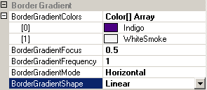
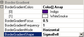
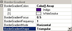
The concept of gradient shapes is easier to understand with some rendered examples, as provided by the following table. In the samples we use BorderGradientMode=Horizontal, which makes the gradient flow from left to right. In order to make the samples match with what was said above, we also set the BorderGradientFocus=0.5 (this moves the peak of the selected shape to the middle of the rendered gradient - please see the reference section on BorderGradientFocus for more details).
| BorderGradient settings | Result |
 |
 |
|
The linear gradient shape ignores the value set for BorderGradientFocus. Therefore it is not possible to move it's focus. |
|
 |
 |
| This show the color-representation of a bell curve: The middle part of the gradient shows only little color blending - the ending color (WhiteSmoke) prevails. The middle part on both sides of the center blends the colors quiet quickly, while the blending slows down towards the left and right edges and the start color (Indigo) prevails. | |
 |
 |
| The triangular shape is nothing more then a linear rendering on both sides of the peak. With the focus set in the center of the gradient (0.5) it gives the same result as a gradient with BorderGradientShape=Linear and BorderGradientFrequency=2. The only difference is, that the Triangular shape allows to freely move around the focus (the peak of the shape) along the axis of the gradient, while this is not possible if the BorderGradientShape is set to Linear. |
If specified at the component-level for a tooltip component (i.e. by defining the BorderGradientShape directly for the component), the assigned shape will become the default BorderGradientShape for the tooltips of all controls on the same form:
'Assign a new linear gradient shape to the tooltip component
Me.MultiLine.GetMultiLineToolTip(Panel1).BorderGradientShape = GradientShape.SigmaBell
This default BorderGradientShape can be overridden for each control through the Override-property provided to all controls on the same form by the tooltip component (see "The Override-Property").
If the override-value for the BorderGradientShape has to be set or changed at runtime for the tooltip of a specific control, code like the following is needed:
'Assign a new linear gradient shape to the override-object for Panel1
Me.MultiLine.GetMultiLineToolTip(Panel1).Override _
.BorderOverride.BorderGradientShape = GradientShape.Triangular
Example 1
This statements define a linear gradient border at the component level. The individual colors of the BorderGradientColors-property are changed and a new BorderGradientShape is defined:
'define a linear gradient border for the tooltips provided by the component (MultiLine).
Me.MultiLine.Border = BorderStyle.LinearGradient
Me.MultiLine.BorderGradientMode = LinearGradientMode.Horizontal
Me.MultiLine.BorderWidth = 15 'make the border 15 pixel wide
'assign the start-color...
Me.MultiLine.BorderGradientColors(0) = Color.OrangeRed
'...and the end-color for the gradient.
Me.MultiLine.BorderGradientColors(1) = Color.Blue
'set the gradient shape = Triangular...
Me.MultiLine.BorderGradientShape = GradientShape.Triangular
'...and the move it's focus to a position left of the center.
Me.MultiLine.BorderGradientFocus = 0.34